2018–2020

Real-Time Dashboard

Product design for a real-time dashboard to monitor video streaming performance. This project includes several iterations spanning three years.

Release Blog Posts:

Dashboard showing charts and world map

Defining a new set of metrics for monitoring live events

Initial Team:

Head of Product

Senior Engineer

Front-end Engineer

Product Designer (me)

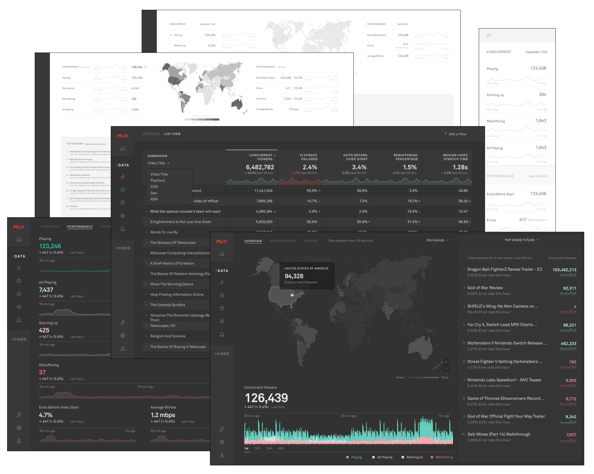
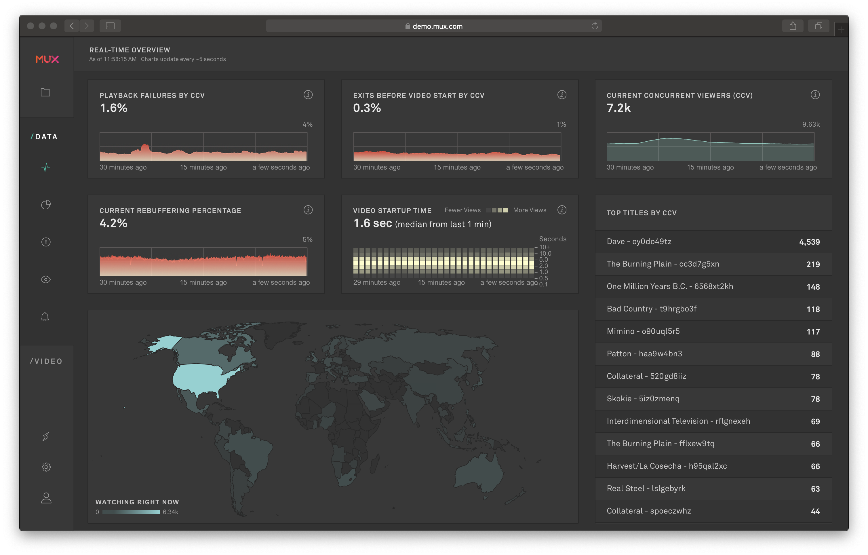
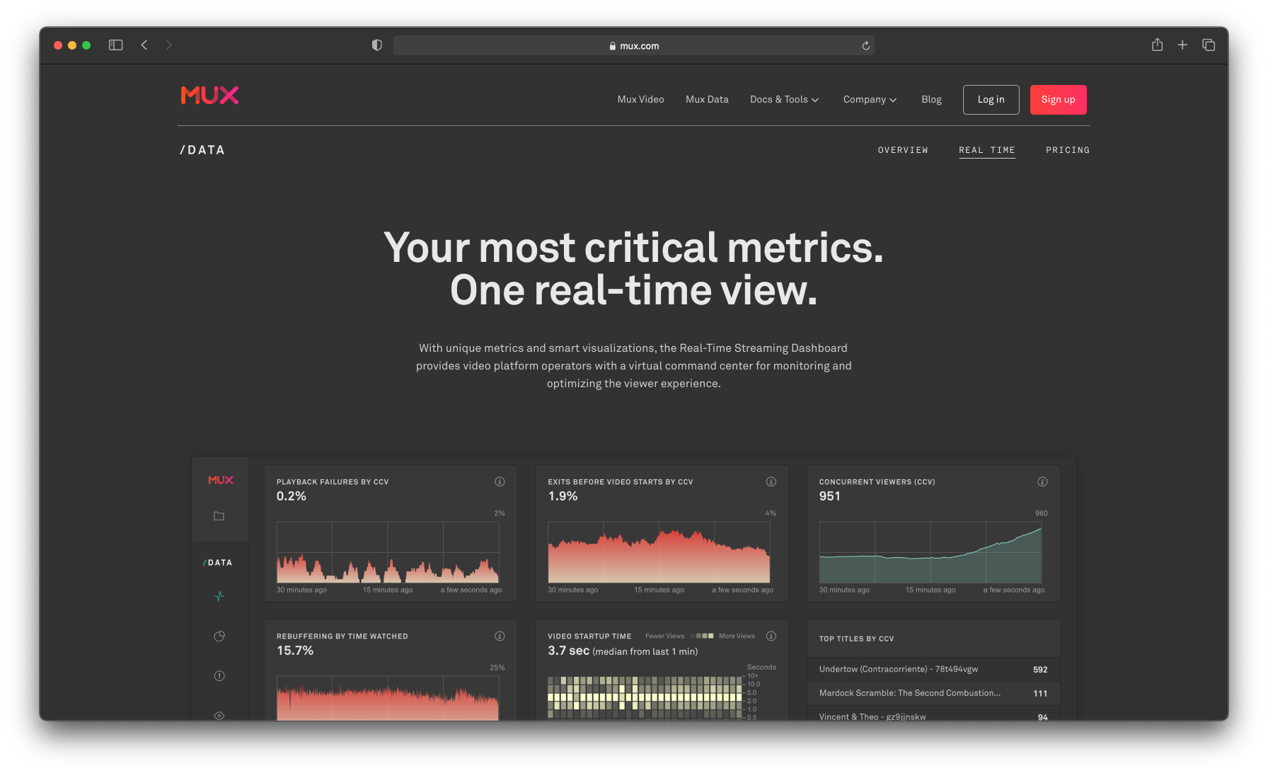
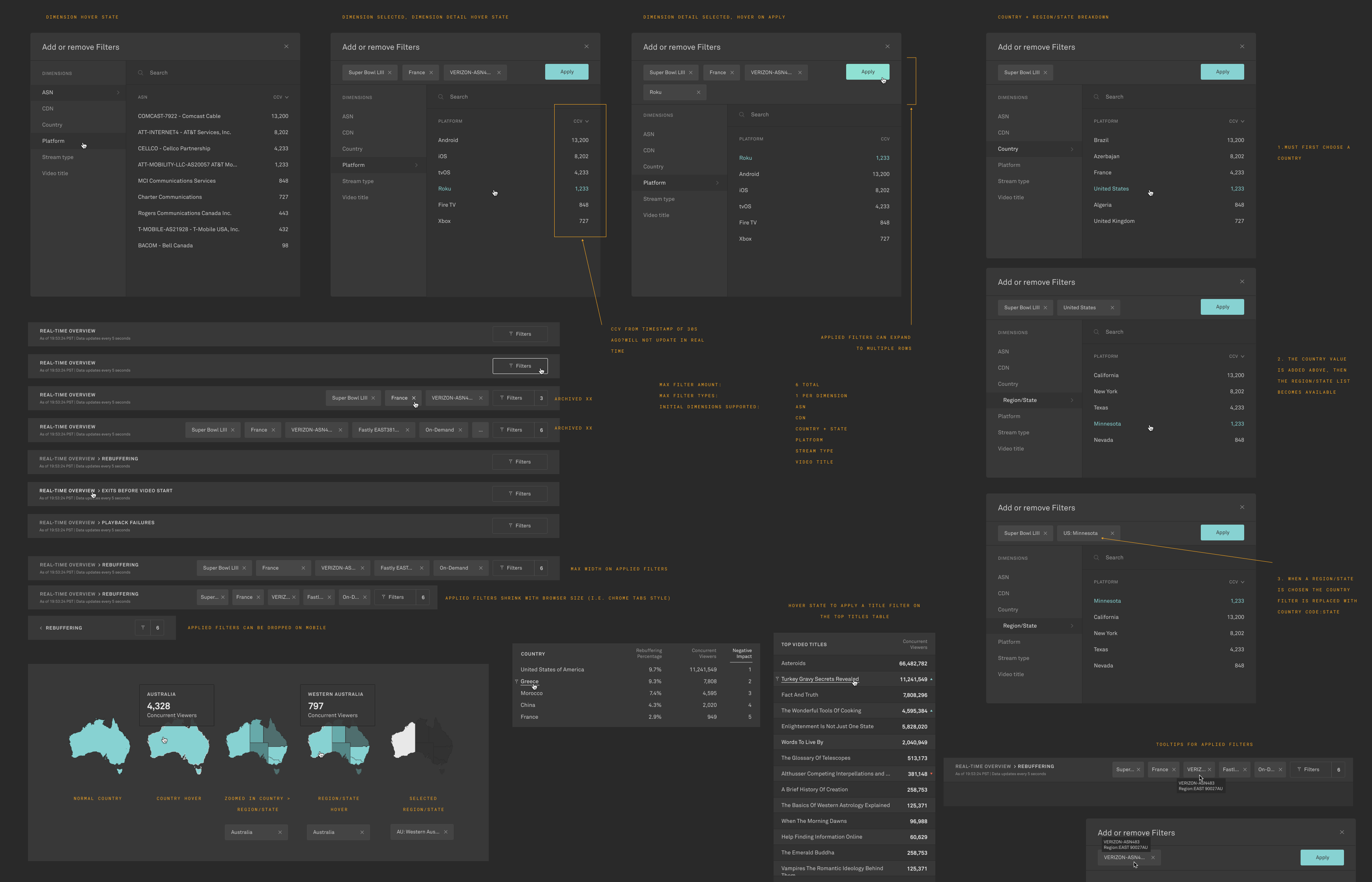
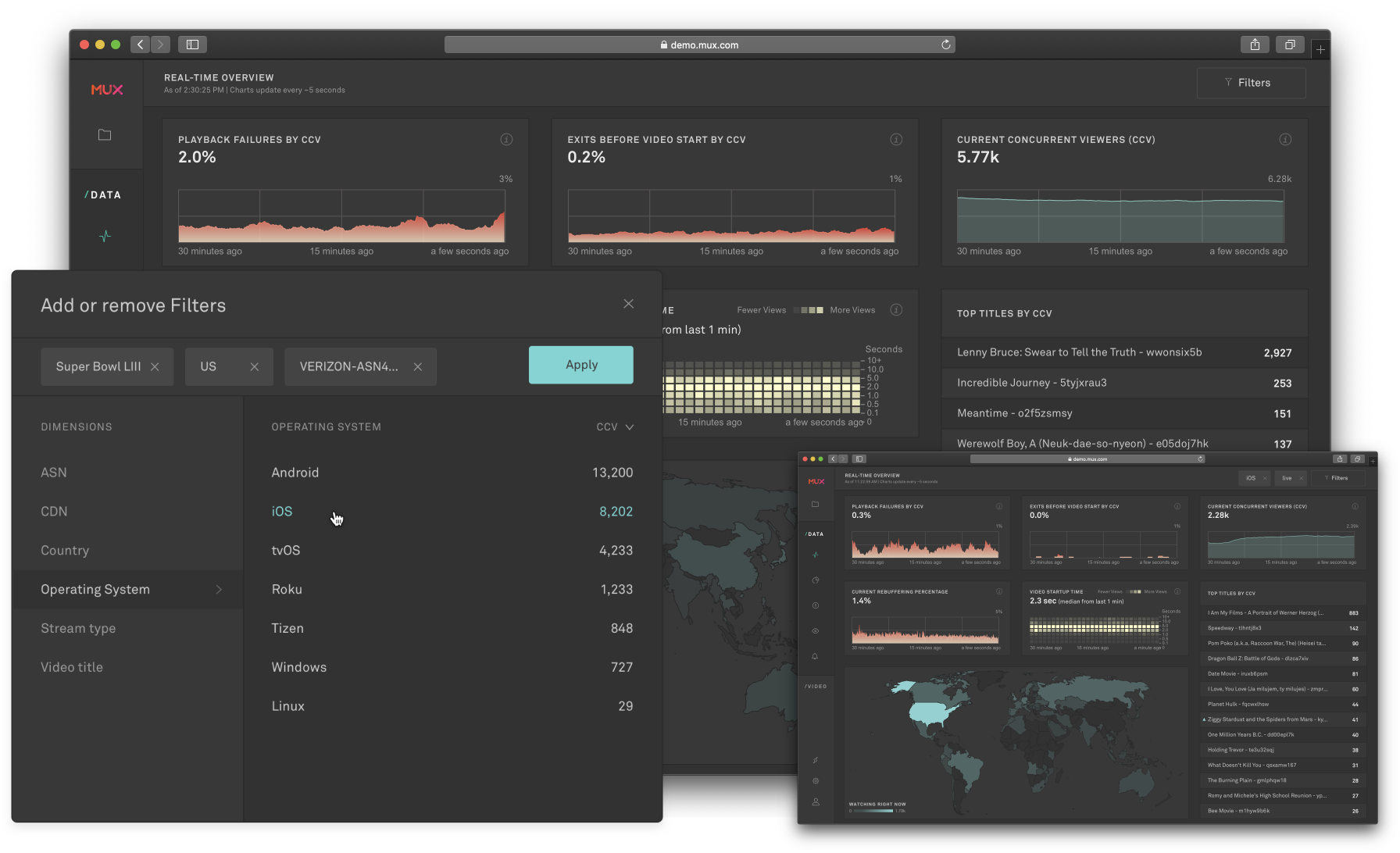
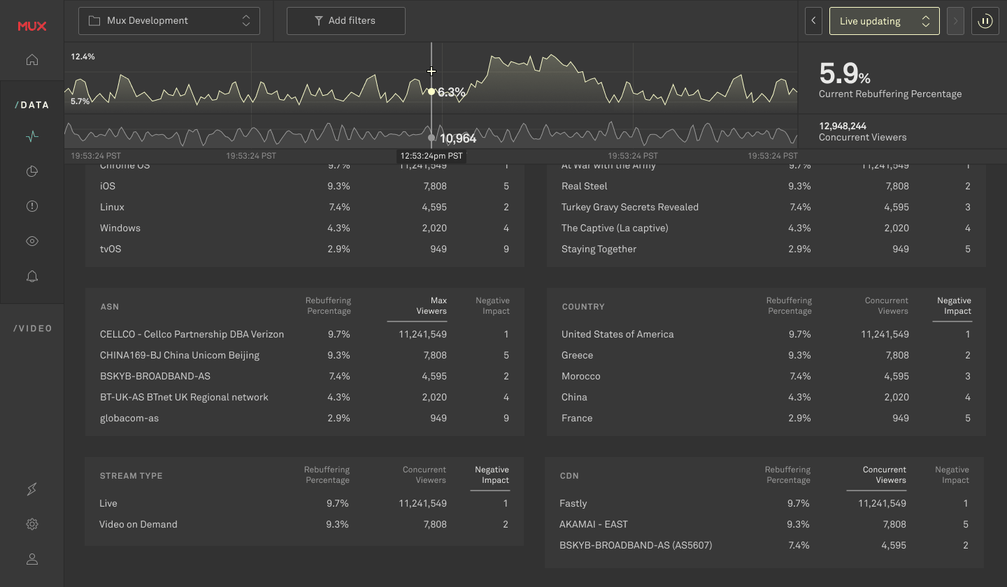
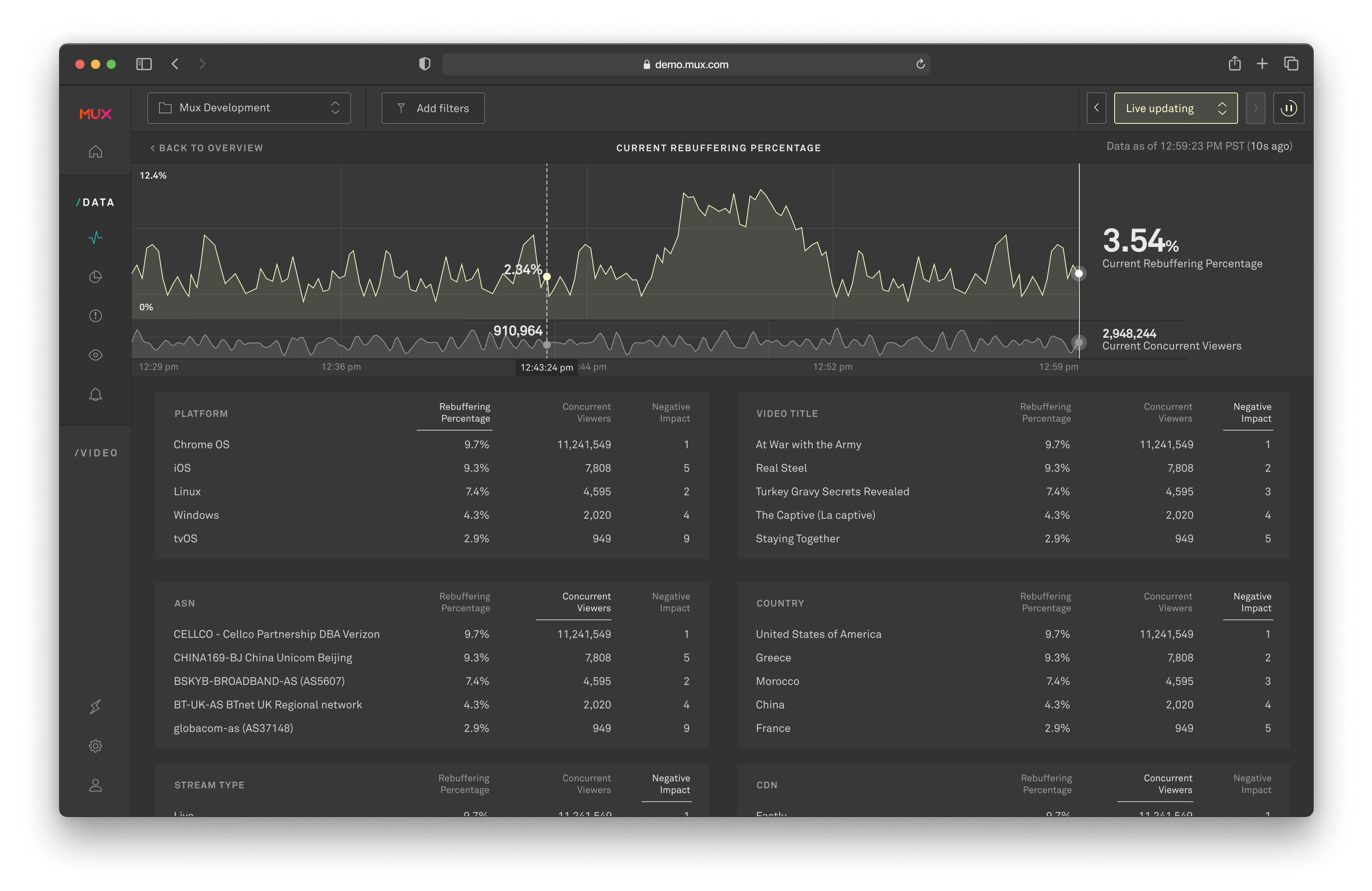
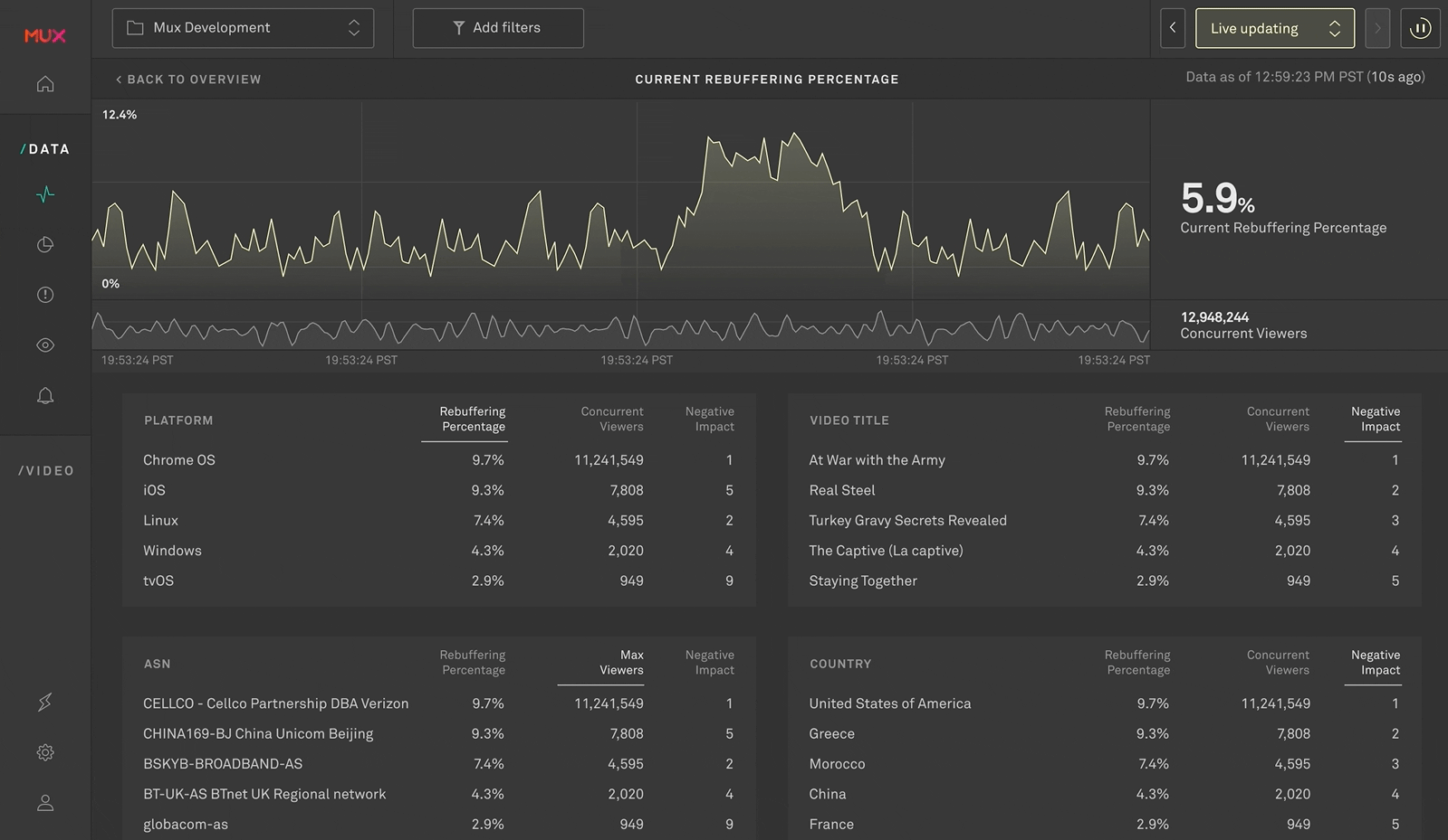
Mux Data is an analytics platform for video performance that helps video teams understand the quality of experience they're delivering to their customers. Metrics include things like buffering, initial loading times, playback issues, etc.

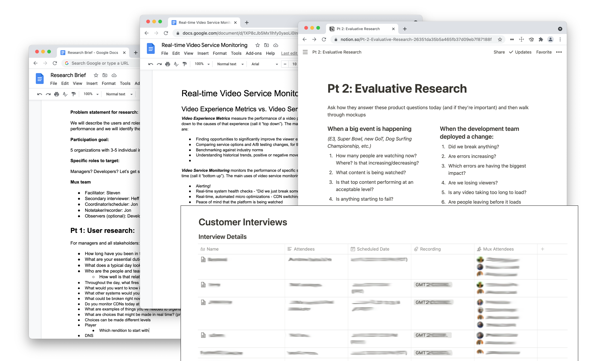
For the past year we had been talking with our customers about bringing real-time data to our analytics product. This involved phone calls, video chats, and on-site visits with customers all over the world with varying types of video platforms. Our two target customers were large media companies running big online events and live streaming software companies.

Overlapping docs pages showing research notes

Customers felt blind during live events. They needed a central point to see problems in real time.

Our existing Mux Data product was failing our customers who were hosting live streaming events. The large media customers had dedicated ops teams, war rooms and NOCs. They were monitoring everything in real time except for their video performance metrics. They wanted Mux Data up on the big TV's of their war rooms telling them everything was okay or no, in fact something about their video was failing.

Designing for new screen sizes and a new category of metrics.

Based on our customer feedback, a single-page dashboard updating in real time was the perfect starting point for this new product category. But this also meant a responsive UI scaling up to large screen sizes, real-time charting, and interaction-free usage... features our existing UI did not have. It also meant a new way of calculating video metrics and differentiating these new metrics from our historical metrics. One way to do this visually was having the real-time product use an expanded color palette and new "dark mode" that would also look great in these (usually) dark war rooms and NOCs.

multiple dashboard layouts overlapping each other

Early sketches and mocks to test layout options

mixture of color samples on a dark background

Color explorations for a new dark mode that would differentiate this part of the UI yet still feel "Mux" in a dark Network Operation Center (NOC).

Dashboard showing charts and world map

Real-Time Dashboard 1.0

Designing a landing page for the initial launch

After the majority of the product design work was done for this first release I switched gears to design the landing page for the product launch. We got to highlight a lot of the design choices as the marketing features so I also did some of the copywriting.

View the current marketing page here

Dark-themed landing page to match the dark-themed real-time dashboard

Results: Monitoring streaming for the World Cup and Super Bowl

We closed several large enterprise deals specifically because of this dashboard. It became our differentiator and competitors scrambled to copy it. It was used as the primary video performance monitoring tool for the World Cup (w/ CBS) and the Super Bowl (twice: CBS in 2019, Fox in 2020).


Release #2: Adding filters

Released: January 2019

We had always planned on adding filters to the real-time dashboard but we separated this work into a separate release so we wouldn't slow down the initial launch of the dashboard. This also gave us time to get feedback on the initial dashboard and learn about what types of filters would be most valuable. Within a few months after the initial launch we released this filtering functionality.

redlined spec sheet showing the different interactions for filtering

Real-time interaction states and specs for new top nav bar

Different types of teams need different types of data

This was something our user research had shown from the start and was a guiding design principle. Large organizations often have specialized roles or even entire teams dedicated to different platforms and/or video players. A large broadcast media operations team responsible for 7 million concurrent viewers obviously has very different needs than a small startup live streaming user-generated content through a single native app. They likely care about the same real-time metrics but how they slice the data is going to vary.

We released this with an initial set of seven filters (one for each dimension). This allowed our customers to create as many unique dashboards as they needed. Every team, screen, or "war room" could get the view that makes the most sense for them.

overlapping windows showing a filter modal and a dashboard with filters applied

New real-time filter modal + top nav bar

A small color change

Initially the color choices were meant to be prescriptive and help communicate if the timeseries were trending good/bad but for a number of reasons it was challenging technically to do that well. The y-axis on the charts also worked best if they were dynamic rather than fixed. For these reasons we didn't want to show so much red and cause unnecessary alarm. We went back to a more neutral off-white/yellow and kept the green for the positive CCV timeseries to differeniate it from the other metrics and correlate it to the map.

Release #3: Metric detail pages "Isolate the problem"

Released: April 2019

The dashboard with the added filters had been doing great with our customers in helping them "see the problem" in real time but we always knew it wasn't enough to just help them find those problematic metrics, they needed to "isolate the problem" much more quickly. The data cards on the dashboard were always designed to be clickable and give customers a detail page to drill down to for their metrics. We went through a lot of design exercises on what would be most valuable [and feasible] on this detail page. We ultimately landed on the "kitchen sink" option that was a heavy tabular view with each metric dimension broken down with the top five values.

screenshot of the macOS Activity Monitor

We actually took "inspiration" from the macOS Activity Monitor because it's a good example of the value of a real-time tabular view for performance monitoring.

animation of a table of data loading and sorting by column

Customers cared most about what was at the top of that list because that's the thing causing their problem. Also, simple column sorting goes a long ways.

a tabular view of real-time data with a large timeseries chart at the top

New single-metric detail "kitchen sink" design πŸ˜…

Missing context: adding a chart for Concurrent Viewers

The release of the metric detail pages added a ton of value for customers. However we realized one small piece of important context that was missing from these new pages: Concurrent Viewers. It's that north start metric for everyone. We had it in the data tables so why didn't we show it in a timeseries like on the main dashboard overview. We added it right underneath the main timeseries so you could see the direct correlation between changes in the main metric and changes in the amount of viewers.

a tabular view of real-time data with two large timeseries charts at the top

Release #3.5: An added chart for concurrent viewers to give additional context

Release #4: Interactive charts and data history

Released: June 2020

For customers that had constant eyes on the real-time dashboard (usually meaning a dedicated ops team), the real-time dashboard was great at showing issues that occur. But companies were only able to diagnose problems in a stream while the issue is occurring. Once the stream returned to normal, the breakdown data in the real-time dashboard just showed the stream’s normal operational performance and the data from the incident was longer available. In addition, there was a drop off in data visibility between the 30 min maximum of the real-time dashboard and when the next hourly aggregation shows up in the historical metrics.

"What happened during that spike?"

This was the main question we needed to help our customers answer. They were opening tickets/issues within their teams to report these events and they didn't have a great way to give context beyond constantly screenshotting the dashboard. Even when their system got back to stable they still held post mortem meetings and they needed data. We had a lot of ideas on how to solve this but all were likely to be expensive because it would involve an increase in the amount data we kept. It was also going to be complex from an interaction standpoint because it would likely introduce "pausing" and "live mode" functionality. I started rough wireframe sketches with a few teammates and then held meetings with the whole stakeholder group to walk through these options so we could understand feasibility.

list of timeseries wireframe options

4 different directions to help discuss feasibility with the product team internally

animation showing a time window being selected on a timeseries chart

Initially we chose the '30 minutes or less' direction that would allow selecting a spike and filtering the data to that window but we ran into technical scope issue

Click a point on the chart to filter the data by that timestamp

We ran into a lot of complexity on the aggregation and technical implementation of being able to highlight entire windows of data but this solution still was a huge win with our customers. Even the customers we had tested early prototypes with weren't disappointed when this shipped instead of the more elegant solutions. We had solved their problem. The filtered view was also in the query params so they could share links with their teams in slack and in ticketing systems.

a tabular view of real-time data with a large, clickable timeseries on top

New interactive charts and "pause/live updating" functionality

Last bit of polish: sticky charts for context and navigation

Making the charts shrinkable but fixed at the top helped keep context when filtering by a timestamp and also made it easier to click between points quickly while parsing the tables.

large timeseries chart that stays pinned with data tables below it

Charts would now shrink and stay pinned up top to help keep context when a user clicked a spike to filter by